Sign-up Flow
Sign-up flows often serve as the initial touchpoint of a product, making it critical to provide a great first impression to support product adoption and enhance user experience. With over 100,000 users for Social Tables, it is essential for us to create a trust-building flow that encourages account creation.
Collaborators:
Sunny Lee
Adam Hughes
Emily Sajewski
Timeline:
June - December 2023
How might we improve on our sign-up flow that enhances the account creation experience?
We prioritized optimizing the following users:
New users for free and paid accounts
New users added as collaborators
New users added as team member
Upgrading free to paid accounts
Wireframe & Storytelling
We build a basic wireframe to get an idea of what we wanted.
(Right) This is one of the first full wireframes we designed while considering the user experience, layouts, and forms, disregarding UI and micro-interactions.
CHALLENGES
Stepper: this component is a visual indicator of a user’s progress. We knew from the beginning we didn’t want to make the process LOOK long to chase users away.
See the visual progress ->
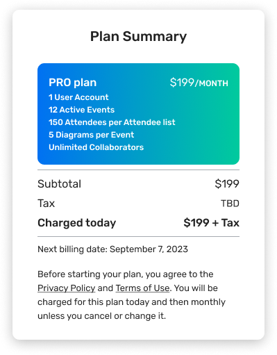
Plan Summary: this component informs users which plan they are purchasing, the features included in the plan, and pricing information.
We focused on condensing information and clear communication.
See the visual progress ->
Your typical wizard. We tried to focus on what needed to be present in the design. Mark the steps, show users where they are. But we wanted short & sweet.
We were open to consider vertical steppers vs horizontal. We were in the right direction but are there other ways?
Though not final, we considered this stepper for a large portion of the project. We liked how a user would be able to see future steps but we finally crossed this as an option when we did not want the wordiness of it.
First iterations included word-dumping into any small idea we had. From there we deleted any irrelevant information and redundancies.
We also tried to strengthen scannability of our content by reducing the number of eye-scanning patterns. We achieved this with each iteration we had.
Though not final, we liked the direction we were going with each iteration. The last step was to consider UI.
Final Prototype
For our final prototype, we focused on condensing the steps down and keeping the flow clean.
For the stepper issue we ran into in our wireframing phase, we had the genius idea of having a mid-step that doesn’t count as a step but still carries across important instructions.
This looks like not labeling “Create an Account or Upgrade” as a step (left). Or “Verify your email” step is no longer labeled as an individual step since there is no action for a user to take on the flow but to go to their email and click a link (right). It became a conclusive step to Step 1.
Our final Plan Summary component was based on the last iteration; however, we took a stronger visual approach to the idea. Since there is a “Free plan” alternative a user could buy, we wanted to highlight the “Pro plan" (our paid plan).
Our final Stepper includes a circular component that visually tracks user progress in the account creation flow as well as a header that titles each step.
We were able to condense what was 5 steps into 3 steps that still filled all technical requirements of account creation.
One drawback to this solution, compared to the alternative, is that a user would not be able to see future steps. However, this solution uses no necessary wording, making the overall page clean.
Takeaways
-
Each page and form of this project requires error pages. Typically, my design process is to first create the non-error flow. However, I found myself running into spacing issues when considering error version when I went back.
For future projects, I want to consider about error pages after every form/page, instead of finishing the non-error flow.
-
More of a product takeaway but our team did not know to consider responsiveness of these pages until we were done with the Web size pages. It is recommended that designers design from small screen to large but we had to go from XL to small and then to medium & large pages.
I hope that in the future, our team would be able to better communication project expectations in the beginning, especially when handling responsiveness.
-
Our team is in a unique spot where we are in the beginning of transitioning between 2 design systems. Having this unique challenge was difficult but it comes down to communicating well with our developer team to decide which system we are utilizing.


